The Noisy Ghost Co. Story
walking the spirit road
For as long as I can remember, I’ve only ever wanted to write books. The difficult and desperate reality of making such a statement, especially in front of anyone who works in the publishing industry, is that the road to career writing is a long and fraught with obstacles — two of which, I learned early, involved wanting to actually make money, and that it required the sort of talent that I wasn’t immediately predisposed to.
Faced with this dark reality (and the necessary hurdle of choosing what to study at the university level), I didn’t quite give up on the dream as much as I turned my attention to the other thing I was reasonably good at, and tucked into a design baccalaureate.
It was the easier option for me. It was the desperate option too: not because I thought I was forfeiting my dream of becoming a writer, but because I knew that design and writing would be forever intertwined for me. I couldn’t rightly take one over the other, but one skill came effortlessly and was already landing me contract jobs at sixteen, while the other required marching through a very dark forest with lots of brambles and strange, gleaming eyes blinking between the trees. If I could go back and tell my younger self to do things differently, I wouldn’t, because I’ve never stopped doing either:
I’ve always made things — sometimes out of pixels, and sometimes out of words. Sometimes both, which is a really good Frankenstein’s monster-example of how storytelling pairs with web design (though reasonably less-hostile towards its maker, I should hope.) I endeavor to create a certain tone and theme with the visual design work I produce, creating atmosphere and conveying genre cues that anchor a persona to their body of work. I could talk endlessly about what structural narrative looks like on a page, and how you can build a website like you were building a plot to a novel. These make for good metaphors when you work with writers and other creative professionals and you’re building a language to discuss design in a way that everyone understands.
Like I said: no regrets.
I never stopped writing, either, for what it’s worth. As it turns out, getting the words down has never been a huge hurdle — it’s trimming them down afterward that often gives me fits.
So where does the spooky come into play?
Noisy Ghost is the poltergeist that has followed me through thirteen years in the industry, urging me onwards and encouraging me to follow my passions: an unseen partner that enlivens my work and informs everything I do because it acts as a reminder that every creative task needs a little something extra added to it: something that gives it “spirit”.
The company was born out of the desperate desire to keep it alive.
Arriving at this point in my career is as much coming to terms with my own narrative as a struggling writer as it does acknowledge that I’ve been successful in my career as a designer: I’ve worked for a handful of emerging and big names in tech, and I’ve done so for a number of years, dipping my hands into everything from marketing to product design. It’s turned me into the sort of candidate that inspires fear in others sitting in the waiting room, preparing to interview for the same job. But there’s always been something missing, despite my success in the field. I’ve never really emerged from that dark forest where the ideas grow amidst the brambles and thorns.
As it turns out, looking far and beyond that setting, it turns out there was a fiend living in the furrows, and a small, mist-wrung cemetery beyond that kept capturing my attention. That landscape had an abandoned Victorian house in it, and a mountainside castle fallen to ruin. I had to let my imagination and long-standing tenure as a horror-fan wander a little bit to fill in those parts of the map to this world, but when it was done, I knew that I had to get out of the nine to five, and I had to see what adventures awaited me beyond that dark forest.
The idea arrived with the insistence of a haunting, when something unseen starts levitating the furniture and knocking things off the shelves. I couldn’t bring myself to exorcise this particular spirit. In fact, I found myself a little bit possessed by the idea.
There’s no way out but through, as they say. The one problem I still haven’t negotiated on this journey, really, is how I’m supposed to carry all my books in this one, tiny backpack.
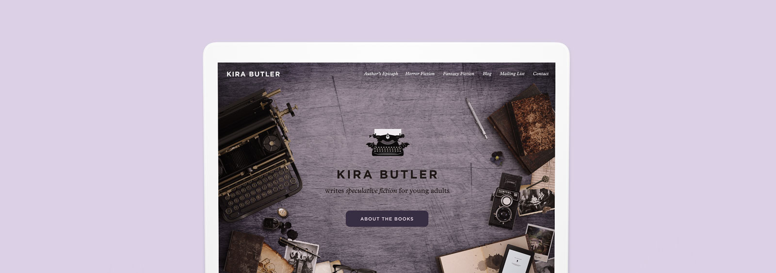
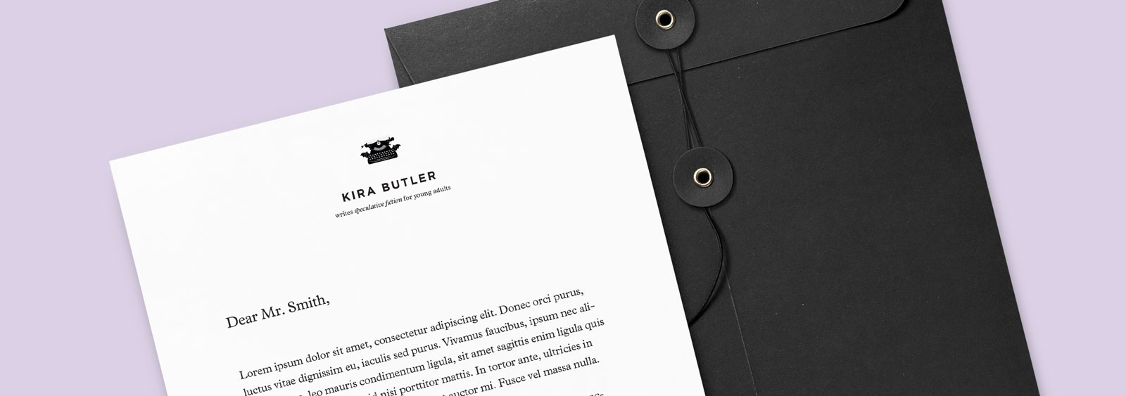
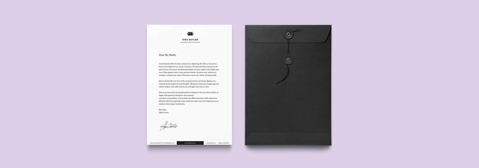
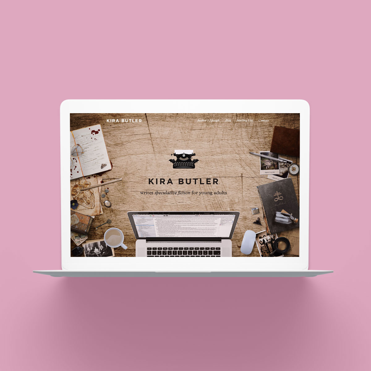
Kira & the Noisy Ghost
July 6, 2018